For a client project, I needed a slider like this:

I needed to find or build a very close match because the client had already approved this exact look on the home page design.
I looked through scores of WP plugins, sliders, galleries, carousels, and rotators. Nothing seemed similar. Though I can work with PHP, HTML, and CSS, I knew I couldn’t build the JS functionality from scratch.
What to do?
Reach Out
I finally reached out to a colleague I met at WordCamp Lancaster 2015, asking if he could build it. The good thing about asking is that it forced me to write out what I needed. Here’s what I realized the slider needed to do:
- rotate 9-12 images
- loop slides (not jump to beginning after final slide)
- arrows to slide back and forth (does not slide on its own)
- faded slides to the left and right (and completely appear as screen widens)
- slides link to a WP page of my choice (can be a featured image)
- show caption or text (if not, I can have the words as part of the image)
- responsive (in a way you think will work)
My colleague gave some great suggestions, including the Slick Carousel.
Slick Carousel
And, oh, joy, the Center Mode was just what I was looking for!
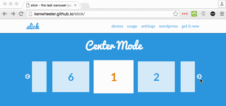
It included most of the functionality I needed for the js part. With the center slide looking differently from all the others, I figured I could use that on the 3 center slides for full color and fade out the outer slides.
With HTML, I could add the text. With CSS, I could change the location of the arrows. And with Advanced Custom Fields, I could give the client an easy interface to add and remove the content right from the home page Edit screen.
And I would have to add Slick to my theme, since it wasn’t a WP plugin.
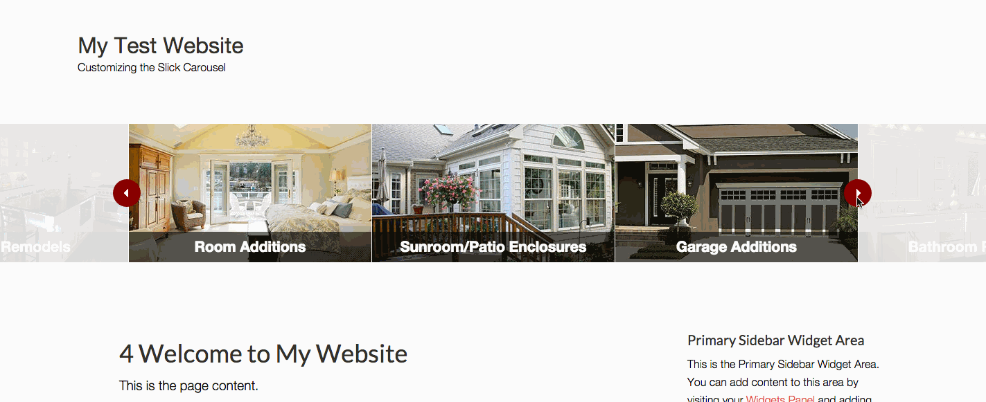
Sneak peek at final look
Using Slick, here’s what the final slider / carousel looked like:
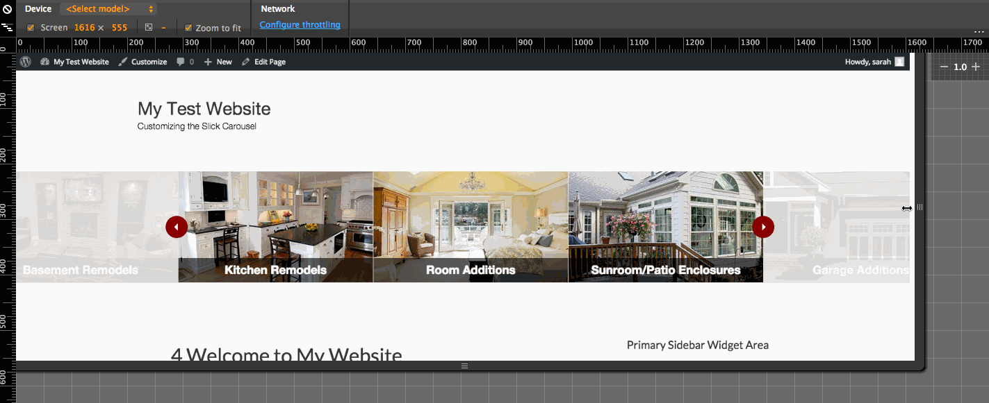
And here is the responsive look, using Chrome Inspector:
So, how to do that?
Step by Step
Slick gives instructions for adding the code to your website. Basically, there are 4 parts to it:
- HTML markup, which I put in the home page template my-theme/front-page.php (see page templates for other types of WP pages)
- CSS styles, which I put directly into my theme’s style.css (for this tutorial, I actually call it from a separate file)
- JS for Slick, downloaded here
- Initialization script for Center Mode, which appears on the site just below the Center Mode demo
But I couldn’t get it working right, so I grabbed the CSS and HTML from
Final Code
PHP Code in my-theme/front-page.php (for sliders not on the home page, see WP Page Templates)
<?php

add_action( 'wp_enqueue_scripts', 'sm_enqueue_slick_scripts' );
function sm_enqueue_slick_scripts() {

	wp_enqueue_style( 'slick-css', get_bloginfo( 'stylesheet_directory' ) . '/slick-4/slick-style.css' );

	wp_enqueue_script( 'slick-centermode', get_bloginfo( 'stylesheet_directory' ) . '/slick-4/slick-centermode.js', array( 'jquery' ), '1.0.0', true );

	wp_enqueue_script( 'slick-carousel', get_bloginfo( 'stylesheet_directory' ) . '/slick-4/slick.min.js', array( 'jquery' ), '1.0.0', true );

}

//* Add new image sizes
add_image_size( 'Home Slider', 350, 200, TRUE );

add_action( 'genesis_after_header', 'sm_home_page_services' );
function sm_home_page_services() {

	$home_services = ''; // init

	if( get_field( 'services_slider' ) ) :

		$home_services .= sprintf( '<section id="slick-content" class="slick-content"><div class="slider">' );

		while ( has_sub_field( 'services_slider' ) ) : if( get_row_layout() == 'service_item' ):

			// Variables
			$service_photo = get_sub_field( 'service_photo' );
			$photo_size = 'Home Slider';
			$service_page_link_id = get_sub_field( 'service_page_link' );
			$service_link = get_permalink( $service_page_link_id );
			$service_caption = get_sub_field( 'service_caption' );

			$home_services .= sprintf( '<div><div class="slide-h3"><a href="%s" title="Go to %s">%s<div class="caption-wrap"><div class="caption">%s</div></div></a></div></div>', $service_link, $service_caption, wp_get_attachment_image( $service_photo, $photo_size ), $service_caption);

		endif; endwhile;

		$home_services .= sprintf( '</div></section>' );

		echo $home_services;

	endif;

}

genesis();
CSS for slider (I enqueued it on the page, but you can also add these styles directly to your main stylesheet)
/* Basic Styles */
body {
    background-color: #f2f2f2;
    color: #000000;
    font-family: 'Helvetica Neue', sans-serif;
    font-size: 19px;
    line-height: 1.625;
}

/* Slick Carousel Slider */
.slick-content {
    overflow: hidden;
}

.slider {
    width: 1173px;
    height:200px;
    margin: 20px auto;
    text-align: center;
}

.slick-slider {
    position: relative;
    display: block;
    -moz-box-sizing: border-box;
         box-sizing: border-box;
    -webkit-user-select: none;
       -moz-user-select: none;
        -ms-user-select: none;
            user-select: none;
    -webkit-touch-callout: none;
    -khtml-user-select: none;
    -ms-touch-action: pan-y;
        touch-action: pan-y;
    -webkit-tap-highlight-color: transparent;
}

.slick-prev,
.slick-next {
    background: url(images/arrow-services.png) 16px center no-repeat #860000;
	border: none;
    border-radius: 50%;
    bottom: 6px !important;
    box-shadow: none;
    color: transparent;
	cursor: pointer;
    display: block;
    font-size: 0;
    line-height: 0;
    height: 40px;
    margin-top: -20px;
    outline: none;
    padding: 0;
    position: absolute;
    top: 50%;
	width: 40px;
    z-index: 2;
}

.slick-prev {
    left: 37px;
}

.slick-next {
    background-position: -13px center;
    right: 41px;
}

.slick-prev:hover,
.slick-prev:focus {
    background: url(images/arrow-services.png) 16px center no-repeat #860000;
	border: none;
    left: 34px;
}

.slick-next:hover,
.slick-next:focus {
    background: url(images/arrow-services.png) -13px center no-repeat #860000;
	border: none;
    right: 38px;
}

.slide-h3 .caption-wrap {
    position: absolute;
    bottom: 0;
    left: 0;
    background: rgba(0,0,0,0.6);
    color: white;
    margin: 0;
    display: block;
    width: 100%;
    line-height: 1.4em;
}

.slide-h3 .caption {
    color: white;
    font-size: 21px;
    font-weight: bold;
    padding: 9px 2px;
}

.slide-h3 a:hover .caption-wrap {
    background: rgba(0,0,0,0.8);
}

.slick-list {
    position: relative;
    display: block;
/*     overflow: hidden; */
    margin: 0;
    padding: 0;
    margin-right: 1px;
}

.slick-list:focus {
    outline: none;
}

.slick-list.dragging {
    cursor: pointer;
    cursor: hand;
}

.slick-slider .slick-track,
.slick-slider .slick-list {
    -webkit-transform: translate3d(0, 0, 0);
       -moz-transform: translate3d(0, 0, 0);
        -ms-transform: translate3d(0, 0, 0);
         -o-transform: translate3d(0, 0, 0);
            transform: translate3d(0, 0, 0);
}

.slick-slide {
    display: none;
    float: left;
	opacity: .1;
	-ms-filter: "progid:DXImageTransform.Microsoft.Alpha(Opacity=10)"; /* IE 8 */
    height: 200px;
    min-height: 1px;
    position: relative;
    margin-right: 1px;
}

.slick-active {
    opacity: 1;
	-ms-filter: "progid:DXImageTransform.Microsoft.Alpha(Opacity=100)"; /* IE 8 */
}

.slick-track {
    display: block;
    position: relative;
    top: 0;
    left: 0;
}

.slick-track:before,
.slick-track:after {
    display: table;
    content: '';
}

.slick-track:after {
    clear: both;
}

.slick-loading .slick-track {
    visibility: hidden;
}

.slick-slide img { display: block; }
.slick-slide.slick-loading img { display: none; }
.slick-slide.dragging img { pointer-events: none; }
.slick-initialized .slick-slide { display: block; }
.slick-loading .slick-slide { visibility: hidden; }
.slick-vertical .slick-slide {
	display: block;
    height: auto;
    border: 1px solid transparent;
}

.slick-arrow.slick-hidden {
    display: none;
}

.slick-loading .slick-list {
    background: #fff url('images/ajax-loader.gif') center center no-repeat;
}

@media only screen and (max-width: 1150px) {

	.slider {
	    width: 400px;
	    height:200px;
	    margin: 20px auto;
	    text-align: center;
	}
	.slide-h3 .caption-wrap {
    	background: black;
    }
}
The main JS for initialization. (customized from the CenterMode js)
jQuery(function( $ ){

    $('.slider').slick({
		centerMode: true,
		centerPadding: '60px',
		slidesToShow: 3,
		speed:1500,
		index: 2,
		responsive: [{
		    breakpoint: 1150,
		    settings: {
		    	slidesToShow: 1
		    }
		}]
	});

});
I want to use this silder for my Beautiful Technology site more accurately, but I want to change the slider buttons to numbers, but I can’t think of it. I wonder if I apply the explanation here?